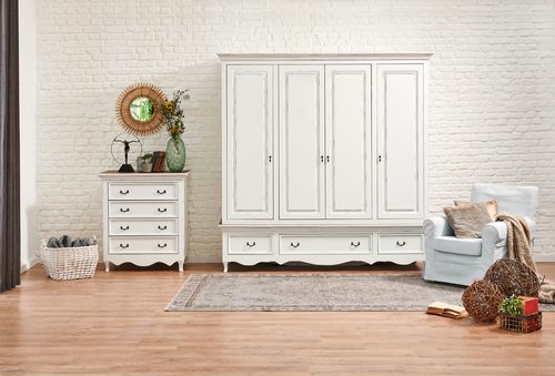
The right color scheme can change the mood of a house in a big way, and artists and designers seem to be breaking color rules more than ever. Colors are used much more expressively today, with little regard for traditional color schemes or rules “Colors that are “loud,” “bright,” and “unrelated” are used on clothing, furniture, interior and exterior design, ceremonies, and other things. Home decor and interior design experts say that white or natural wood furniture will keep the room from looking dated. This is because warm neutral colors have a calming and grounding effect, and the charm of this color has a simple beauty that goes well with a lot of other color schemes.
Others say that if you can’t decide on a color, you should go with pastel shades of yellow or light cream. They say that these colors not only make us feel calm, but also help us succeed in all areas of life, since pastel colors are known for their calming effect and give the overall theme of the house a fresh touch. Some colors make you want to work hard, while others make you feel calm and relaxed. However, all colors have the power to change our mood and turn confusion into clarity, fear into self-confidence, or set the scene for an escape with candy-colored tones like pink, turquoise, and lavender that are pleasing to the eye and go well with the summer vibes of pastel trend.
In an interview with Hindustan Times, Khanindra Burman, CEO and Co-Founder of Wurfel, talked about wardrobe colors. He said, “It’s a design trend to keep the closet separate from the bedroom as a walk-in space. But the majority of our closets are still in our bedrooms. A wardrobe is a product that is bigger and has a different shape. So, from a design point of view, the color scheme and pattern become very important. The way a wardrobe looks is very important for the whole look of the room.
He also said, “Most of the time, we match the color of the closet to the rest of the room so it doesn’t look like a big box.” The way the wardrobe’s doors are designed can make your bedroom look very special. We all know that putting mirrors on your doors can make your space look much bigger. Similarly, using colors that go together makes it look like it’s always been there. Fluted treatments, fabric finishes, and doors with vents are all in style around the world right now. Fluted finishes can be made of fluted glass, fluted veneer, or fluted lacquered panels. As a global trend, we also see a lot of tinted glass on black aluminum frames. Lastly, don’t make your closet just a place to store things. Instead, think of it as a place where you can dress, work, read, or sit.
Ashley, the Business Head at Newton Inex, said, “Multi-functional storage and space has always been in high demand when it comes to wardrobe designs, but so has experimenting with colors when choosing a wardrobe to match the rest of the room.” Monotonous colours are a passé. The best way to choose a good color for a wardrobe is to play with the colors of the room and key furniture to create harmony and balance.”
He said, “Nature-inspired or neutral colors for your closet are also a safe bet if your room has a lot of different colors, so that a balance can be made.” If you have a room with a simple design, it can be a good idea to try out patterns and designs on the wardrobe instead of a solid color. These designs may make the room look better as a whole and make it stand out.


![10 Countries With the Best Healthcare in the World [Statistical Analysis] Countries With the Best Healthcare in the World](https://articleify.com/wp-content/uploads/2025/07/Countries-With-the-Best-Healthcare-in-the-World-1-150x150.jpg)


