
You open your new brokerage account, type in a stock ticker, and freeze. A chaotic screen flashes red and green bars at you. It looks like a broken heart monitor. I see new traders panic at this exact moment. They assume they need a Wall Street background to understand it. You don’t. Those jagged lines just tell a story about human psychology.
They track fear and greed in real-time. If you want to know how to read stock charts, you just need to learn the visual language of price action. By seeing exactly what buyers and sellers are doing, you gain a massive edge. You spot trends early. You ride the momentum. You protect your cash. Let’s strip away the noise. I’ll show you exactly what you are looking at, which patterns actually win, and how to use them to make smart trades.
The Core of Technical Analysis
Before we look at the screen, you need the right mindset. We are talking about technical analysis. Fundamentals care about balance sheets, CEOs, and quarterly earnings. Technicals don’t. We only care about price and volume. The idea is simple: every piece of news or gossip is already baked into the current price. All that matters is the trend. History repeats itself because human emotions never change.
When you look at a chart, you are watching a live fight between the “bulls” (buyers) and the “bears” (sellers). The chart just keeps the score. In 2026, algorithmic systems process this data in milliseconds, making the market move faster than ever. You don’t need to beat the algorithms, but you do need to understand the footprints they leave behind. Master this core philosophy, and you stop guessing. You start executing trades based on proven momentum rather than random hopes.
|
Concept |
Market Function |
Why It Matters |
|
Technical Analysis |
Studying past price data to predict the future. |
Helps you time your market entries and exits. |
|
Fundamental Analysis |
Evaluating financial health. |
Helps you pick companies to hold long-term. |
|
Bulls vs. Bears |
The fight between buyers and sellers. |
Sets the daily momentum of the stock. |
The Anatomy of a Candlestick
To make sense of the screen, zoom in on the building blocks: Japanese candlesticks. Rice merchants created these centuries ago. It’s a clever design that packs four data points into one shape. Every candlestick represents a timeframe. On a daily chart, one candle is one day. On a five-minute chart, you get a new candle every five minutes. Each one tracks the Open, High, Low, and Close (OHLC).
The thick block in the middle is the real body, which shows the difference between the open and close price. Green means the stock closed higher. Red means it closed lower. See the thin lines sticking out the top and bottom? Those are wicks. They show the absolute highest and lowest prices hit during that timeframe. A long upper wick means buyers pushed the price up, but sellers slapped it back down. Wicks show you exactly where price got rejected.
|
Candlestick Part |
Visual Appearance |
What It Tells You |
|
Real Body |
Thick middle block. |
The difference between open and close price. |
|
Upper Wick |
Top line. |
The absolute highest price reached. |
|
Lower Wick |
Bottom line. |
The absolute lowest price reached. |
|
Green Candle |
Closes above the open. |
Buyers dominated the session. |
|
Red Candle |
Closes below the open. |
Sellers dominated the session. |
High-Probability Candlestick Patterns That Actually Work
I never trade based on one random candle. I look for specific groupings. Do they work? Data from massive backtesting studies in 2026 says yes. Despite heavy algorithmic trading, about 66% of these patterns beat a basic buy-and-hold strategy. I specifically watch for the Engulfing patterns. A Bullish Engulfing happens when a small red candle forms, and the next period, a huge green candle completely swallows it.
Buyers just violently seized control. On the flip side, a bearish engulfing happens when a small green candle gets swallowed by a massive red one. At a clear resistance level, this pattern hits a win rate around 70%. You will also spot the bullish piercing line at the bottom of an ugly downtrend, which confirms a reversal roughly 72% of the time. The Hammer drops at the bottom of a downtrend with a tiny body and a long lower wick. Buyers bought the dip so hard the price recovered by the close.
|
Pattern Name |
Visual Clue |
Statistical Edge & Meaning |
|
Bearish Engulfing |
Large red body eats a small green body. |
Reliable sell signal; near 70% win rate at resistance. |
|
Bullish Piercing Line |
Green candle closes above midpoint of prior red. |
High-success reversal signal; confirms roughly 72% of the time. |
|
Hammer |
Small body at the top, long lower wick. |
Bullish reversal; buyers defended the price floor. |
|
Shooting Star |
Small body at the bottom, long upper wick. |
Bearish reversal; sellers rejected higher prices. |
Mapping the Market: Support, Resistance, and Trendlines
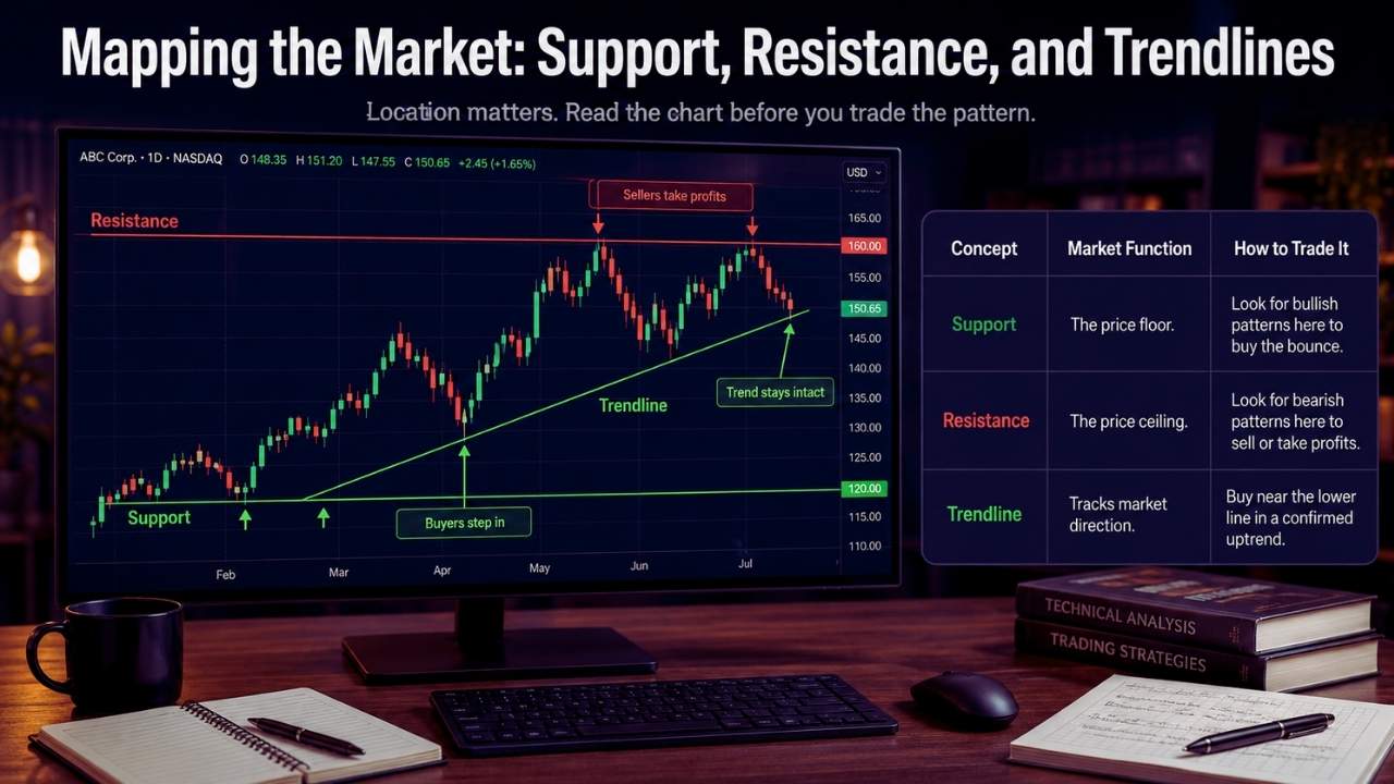
You can memorize patterns all day long. But if you ignore where they happen, you will lose money. Location is everything in this game. Markets have memories. Support and resistance are invisible lines where stocks historically get stuck. Support is your floor. Buyers step in here to stop the bleeding. Big players see the stock as cheap, so they park massive buy orders right there. Resistance is your ceiling.
Sellers step in and take profits, stopping the climb. They view the stock as expensive. Connect these bounce points with a horizontal line, and you have a map of human psychology. Spot a Hammer right on a support line? Your odds of winning just skyrocketed. Stocks don’t move in straight lines. They zigzag. An uptrend makes higher highs. A downtrend makes lower highs. Draw a diagonal line under an uptrend to see the momentum. Stay above the line, and the trend is your friend.
|
Concept |
Market Function |
How to Trade It |
|
Support |
The price floor. |
Look for bullish patterns here to buy the bounce. |
|
Resistance |
The price ceiling. |
Look for bearish patterns here to sell or take profits. |
|
Trendline |
Tracks market direction. |
Buy near the lower line in a confirmed uptrend. |
The Undeniable Importance of Trading Volume
Price is the car. Volume is the engine. Volume sits at the bottom of your screen as vertical bars. It tells you exactly how many shares traded hands. It is the market’s ultimate lie detector. The 2026 Nasdaq Russell reconstitution saw record trading volumes surpassing four billion shares, proving that institutional money moves markets. If a stock jumps 5% in a day, check the volume. Low volume? Hardly anyone played.
It’s probably a retail fake-out. High volume? Banks and hedge funds just stepped in. That move is real. Never trust a breakout without volume. When you see a massive red candle on high volume, it signals institutional panic selling, and you need to get out of the way. Volume confirms every single pattern you see. If the pattern screams buy, but the volume is dead, the signal is weak. Rely on volume to validate your entries.
|
Volume Scenario |
Price Action |
What the Market is Telling You |
|
High Volume |
Price breaks out upward. |
Smart money is in; the move is reliable. |
|
Low Volume |
Price creeps upward. |
Weak conviction; high risk of a fake-out. |
|
High Volume |
Price crashes downward. |
Institutional panic selling; get out of the way. |
5 Steps on How to Read Stock Charts in Real Time
Knowing the definitions is one thing. Trading them is another. If you want to know how to read stock charts without losing your mind, follow this exact five-step routine. Identify the Broad Trend first. Zoom out to a 1-year chart. Moving bottom left to top right? Uptrend. Trade with the momentum. Don’t catch falling knives. Next, Draw Support and Resistance. Switch to a 6-month view. Mark the peaks and valleys.
Now you know where the big players are hiding. Hunt for Patterns next. Zoom into the current week. Nearing a support line? Look for a Hammer or Piercing Line. That is your trigger. Confirm with Volume immediately. Check the bottom bars. Buying volume spiking? The smart money backs your play. Finally, Set a Stop-Loss. No setup is perfect. Pick a price where you admit you are wrong before you ever buy. Place a hard stop-loss to survive another day.
|
Trading Step |
Action to Take |
Why It Keeps You Safe |
|
1. Find the Trend |
Zoom out to a 1-year chart. |
Ensures you trade with the market momentum. |
|
2. Map the Zones |
Draw support/resistance lines. |
Gives exact targets for buying and selling. |
|
3. Spot the Pattern |
Look for Hammers/Engulfing candles. |
Provides the trigger to enter the trade. |
|
4. Check Volume |
Verify big money is participating. |
Prevents buying into a fake breakout. |
|
5. Place Stop-Loss |
Pre-determine your exit price. |
Protects you from account-ruining losses. |
Common Pitfalls That Destroy New Traders
Emotions ruin technical analysis. Watch out for these rookie traps. I see beginners layer MACD, oscillators, and moving averages until they cannot even see the price. It causes analysis paralysis. When three indicators say buy and three say sell, you freeze. Keep it clean. Price and volume are king. Ignoring the macro market is another fatal error. You find a flawless setup on a tech stock, but the S&P 500 is crashing because of interest rates.
Your setup will fail. Most stocks follow the broad market. Always check the main index first. Revenge trading is the final boss. You take a hit, lose a quick hundred bucks, and immediately buy back in out of anger to win it back. That is revenge trading. It burns accounts to the ground. Take the loss, close the laptop, and wait for a fresh setup.
|
Common Pitfall |
The Mistake |
The Fix |
|
Chart Clutter |
Conflicting indicators. |
Delete everything except price and volume. |
|
Ignoring the Index |
Trading against a market crash. |
Check the S&P 500 daily trend first. |
|
Revenge Trading |
Forcing a trade after a loss. |
Walk away; wait for a clear setup. |
Final Thoughts
Staring at trading screens does not have to feel like trying to decipher a foreign language. The stock market is simply an arena where millions of human beings make financial decisions based on fear and greed. Those raw emotions leave clear, trackable footprints on your screen every single day.
By mastering the anatomy of candlesticks, identifying your support and resistance floors, and waiting for the volume to prove the move is real, you strip the emotion right out of your investing. Now that you understand how to read stock charts, you can stop guessing and start executing. Start small, practice spotting these high-win-rate patterns on historical data, use strict stop-losses, and let the math do the heavy lifting for you.
Frequently Asked Questions (FAQs) About How to Read Stock Charts
Should I use linear or logarithmic charts?
For day trading or swing trading over a few weeks, a standard linear chart is fine. It spaces price increments equally (e.g., $10, $20, $30). But if you are looking at a 5-year chart of a stock that exploded 500%, you must use a logarithmic (log) chart. Log charts scale based on percentage changes. A move from $10 to $20 (a 100% gain) takes up the same visual space as a move from $100 to $200. It gives you a much more accurate view of historical, long-term trends.
What exactly is a “gap” on a chart, and do they always fill?
A gap is a literal empty space on the chart where no trading happened. If a stock closes at $50 on Monday, announces massive earnings after hours, and opens at $60 on Tuesday, you get a $10 blank gap. Traders have a saying: “Gaps always fill.” This means the price eventually gravitates back down to trade inside that empty space to collect unfilled orders. While not a 100% guarantee, gaps act like heavy magnets for future price action.
Does candlestick charting work for crypto assets?
Yes, it works perfectly. The psychology of fear and greed is exactly the same whether you trade Apple, gold, or Bitcoin. Because cryptocurrency markets operate 24/7 without opening and closing bells, candlestick patterns and horizontal support zones are incredibly respected by crypto algorithms and institutional traders.
What is a Point and Figure chart?
Most people stick to candlesticks, but Point and Figure (P&F) charts are a completely different animal. They ignore time and volume entirely. They only use columns of X’s (rising prices) and O’s (falling prices). You only mark a new X or O if the price moves a significant, predetermined amount. It filters out all the minor daily “noise” and highlights massive, undeniable trend shifts.


